
The Violence Epidemic in Two Charts

The University of Washington’s Institute for Health Metrics and Evaluations has a handy data visualization tool here on worldwide causes of death and disability. The Venezuela pages are somewhat startling.
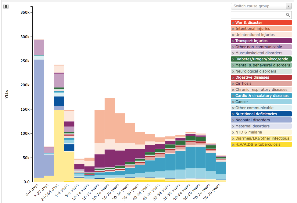
One key measure is Years of Life Lost: a statistical measure of the years of life a person would have been expected to live had they not died prematurely.
In IHME’s tool, the Y-Axis shows thousands of Years of Life Lost produced by deaths of people from a given age group, shown along the X-Axis. It takes a bit of looking, but the chart makes a bit of sense.
Here is the Years of Life Lost chart for Venezuela in 1995:
The peach-colored strip on top represents Years of Life Lost, by age group, from “intentional injuries” (read: homicide and suicide).
Now, here’s the same chart for 2010.

Caracas Chronicles is 100% reader-supported.
We’ve been able to hang on for 22 years in one of the craziest media landscapes in the world. We’ve seen different media outlets in Venezuela (and abroad) closing shop, something we’re looking to avoid at all costs. Your collaboration goes a long way in helping us weather the storm.
Donate